«Awareness Lab» is a mobile meditation app that offers a variety of meditations and courses, daily exercises, and coaching using AI to help you relax and focus.
«Awareness Lab» is a mobile meditation app that offers a variety of meditations and courses, daily exercises, and coaching using AI to help you relax and focus.

Project Overview
To present this project in a clear and structured way, I used the STAR method (Situation, Task, Action, Result). This framework helps explain the context of the project, my responsibilities, the actions I took, and the measurable outcomes achieved.
To present this project in a clear and structured way, I used the STAR method (Situation, Task, Action, Result). This framework helps explain the context of the project, my responsibilities, the actions I took, and the measurable outcomes achieved.
S — Situation
The meditation app market is growing rapidly, projected to reach $7.25B by 2033, yet most products still create friction for users instead of calm.
During market research and 40+ customer development interviews, several recurring problems emerged:
overwhelming onboarding,
too many meditation categories,
subscription walls before value demonstration,
difficult navigation,
lack of personalization,
absence of meaningful AI guidance.
Competitors like Headspace, Calm, and Insight Timer offered extensive content libraries, but users often experienced “choice paralysis”. The challenge was not to create “another meditation app,” but to rethink how meditation products should feel emotionally and cognitively.

T — Task
I joined the project as the sole product designer, owning everything from research to final UI. The goal was to design a meditation app from scratch — one that removes friction, introduces AI-powered guidance, and makes starting a practice as simple as pressing one button.
I joined the project as the sole product designer, owning everything from research to final UI. The goal was to design a meditation app from scratch — one that removes friction, introduces AI-powered guidance, and makes starting a practice as simple as pressing one button.
A — Action
I started by talking to people and not about features, but about their actual experience with meditation and the apps they'd tried. Over 40 interviews later, a clear picture emerged: the biggest barrier to meditation was the apps themselves.
I conducted all interviews myself, asking open-ended questions about habits, frustrations, and moments when users gave up. I turned insights into research artifacts that could directly inform design decisions.
01. Affinity Map
After completing the interviews, I needed to make sense of everything I heard. I grouped insights by theme — not by feature requests, but by underlying frustrations. Six clusters emerged naturally. The most dominant one — complexity and choice paralysis — showed up in nearly every conversation, which immediately told me where to focus first.
After completing the interviews, I needed to make sense of everything I heard. I grouped insights by theme — not by feature requests, but by underlying frustrations. Six clusters emerged naturally. The most dominant one — complexity and choice paralysis — showed up in nearly every conversation, which immediately told me where to focus first.

02. User Personas
The interviews revealed three distinct types of users with very different relationships to meditation. I built personas not as a formality, but to keep real people in mind throughout every design decision. Anna, Dmitry, and Maria became my internal sanity check — whenever I considered adding a feature, I'd ask: does this actually serve any of them?
The interviews revealed three distinct types of users with very different relationships to meditation. I built personas not as a formality, but to keep real people in mind throughout every design decision. Anna, Dmitry, and Maria became my internal sanity check — whenever I considered adding a feature, I'd ask: does this actually serve any of them?

03. Jobs To Be Done
I reframed each pain point as a job the user is trying to get done. This shift — from "users are frustrated by X" to "when Y happens, I want to Z" — helped me move from problems to design decisions. It also made it easier to evaluate features: if a feature doesn't serve a real job, it probably doesn't belong in the MVP.
I reframed each pain point as a job the user is trying to get done. This shift — from "users are frustrated by X" to "when Y happens, I want to Z" — helped me move from problems to design decisions. It also made it easier to evaluate features: if a feature doesn't serve a real job, it probably doesn't belong in the MVP.

04. Pain Points Prioritization
Not all problems are equal. I mapped each pain point by how frequently it came up and how much it blocked users from getting value. This helped me separate what to solve at MVP stage from what could wait. The top two — complexity and paywalls — were both critical and directly shaped the core design direction.
Not all problems are equal. I mapped each pain point by how frequently it came up and how much it blocked users from getting value. This helped me separate what to solve at MVP stage from what could wait. The top two — complexity and paywalls — were both critical and directly shaped the core design direction.

05. Competitive Analysis
I also looked at the market from the outside. I mapped seven apps — international and Russian — across six key features. The pattern was clear: no one was doing simplicity and AI guidance together. Most apps chose one or the other, or neither. This confirmed that the combination of a one-tap experience and an AI assistant wasn't just a nice idea — it was a real gap in the market.
I also looked at the market from the outside. I mapped seven apps — international and Russian — across six key features. The pattern was clear: no one was doing simplicity and AI guidance together. Most apps chose one or the other, or neither. This confirmed that the combination of a one-tap experience and an AI assistant wasn't just a nice idea — it was a real gap in the market.

Design phase
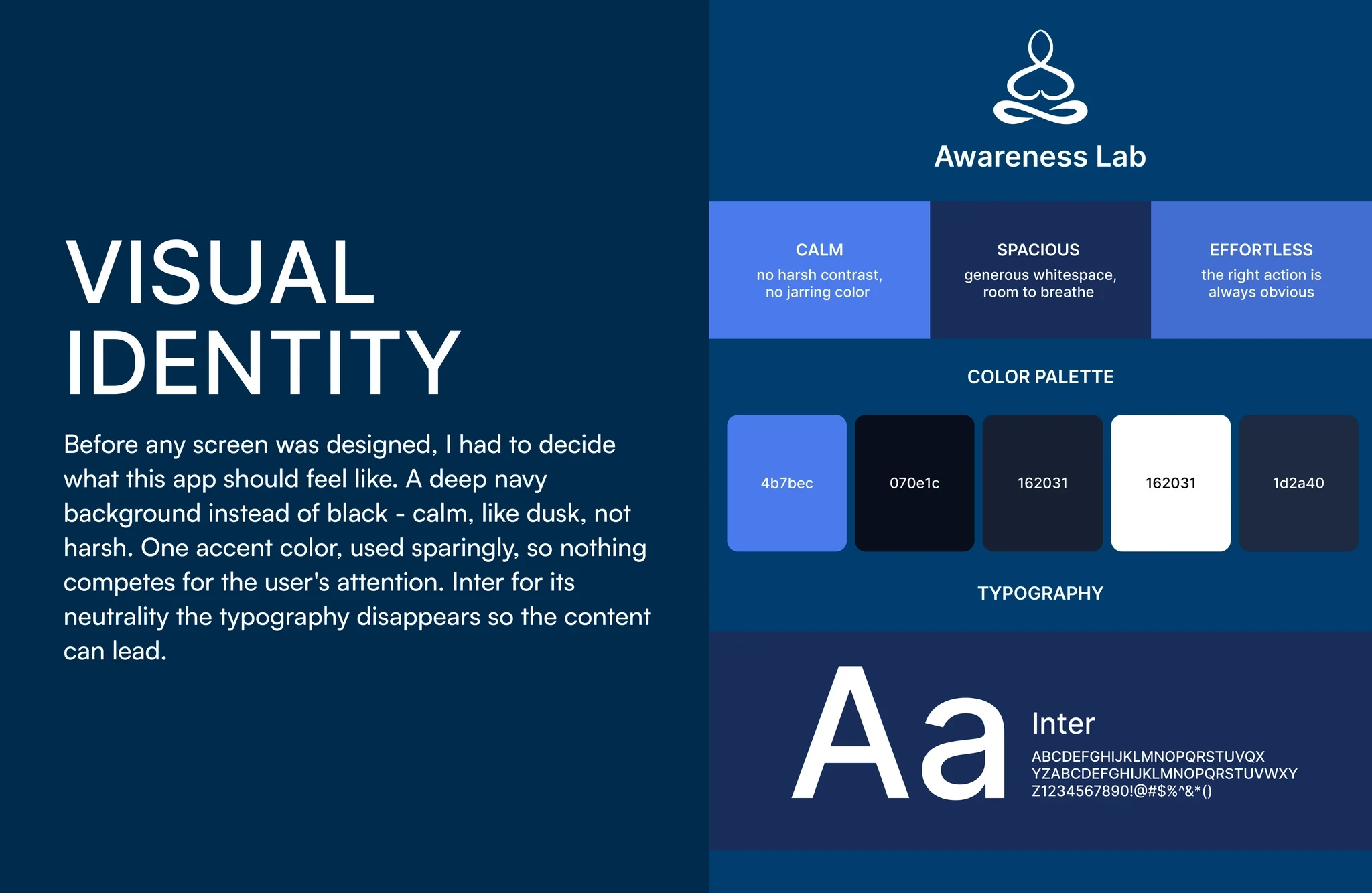
With a clear picture of who I was designing for and what was getting in their way, I moved into design. The client had a clear visual direction from the start - minimalism above all. Fewer icons, less noise, more breathing room. Every design choice was filtered through one question: does this need to be here?
With a clear picture of who I was designing for and what was getting in their way, I moved into design. The client had a clear visual direction from the start - minimalism above all. Fewer icons, less noise, more breathing room. Every design choice was filtered through one question: does this need to be here?


R — Result
This project started with a simple question: why do so many people download meditation apps and never open them again? Forty interviews later, I had my answer, and a clear direction for everything that followed.
The design has been handed off to a developer, and the MVP is currently being built. I made the deliberate choice to design a focused, well-reasoned first version rather than try to solve everything at once, because real user behaviour will always teach more than assumptions will. Once the product is live, that feedback becomes the brief for v2.
Throughout this project I was using AI tools: ChatGPT and Claude to synthesise interview data and surface patterns I might have missed, and Claude Design to prototype screens quickly and test ideas before committing to them in Figma.
Key Learnings
The biggest design challenge was making the home screen feel like a meditation app, not a music player, when your core interaction is a play button, the line is thinner than you'd think. This project also changed how I work. Using Claude, ChatGPT, and Claude Design for data synthesis and prototyping freed up time for the things only a designer can do: understanding people, making judgment calls, and bringing intention to every decision.
The biggest design challenge was making the home screen feel like a meditation app, not a music player, when your core interaction is a play button, the line is thinner than you'd think. This project also changed how I work. Using Claude, ChatGPT, and Claude Design for data synthesis and prototyping freed up time for the things only a designer can do: understanding people, making judgment calls, and bringing intention to every decision.
